Changes to the Mobile SERP: Leverage New Branding Opportunities

enewton@brightedge.com
M Posted 6 years 9 months ago
t 9 min read

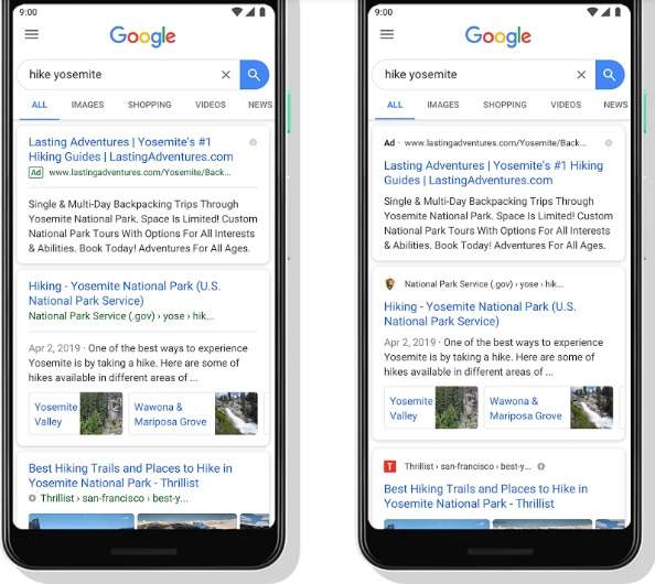
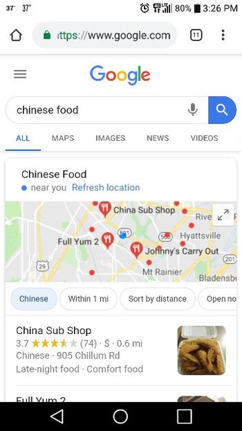
Google recently announced some changes to their mobile SERP layout that are intended to make it easier for customers to recognize the branding of different sites and determine which pages they want to engage with. Read more about SERPs and the primary SERP elements.

Although the change might not be as dramatic as some other Google layout updates, it may have an impact on how organizations optimize their branding for mobile devices. It gives organizations the opportunity to catch users’ eyes immediately through images that appear at the top of each result, and every site should take advantage of this change.

Use a mobile search strategy for your site - BrightEdge
You can see the difference between the old and new mobile SERP here

What this mobile SERP change will mean

Google has explained that this change will place the URL and a small icon at the top of each result. The search engine giant expects that the placement of these features will make it easier for those browsing the SERP to know where the information comes from. This should help users determine easier which sites they want to explore.

How this impacts site owners

With the URL and small icon at the top of the search results, this provides site owners with a good opportunity for branding. Images naturally catch the eyes of users, which is why Twitter posts with images see 35% more retweets than those without.

With your image featured at the top of your result, it will catch the eyes of prospective visitors. It will also make it easier for these users to remember your site when it appears in multiple searches they make. This will improve brand recognition.

Google has also said that this new layout will make it easier for them to add more action buttons and search result cards in the future. If they proceed with this plan, it may provide more opportunities for customers to contact you or make a purchase from you directly from the mobile SERP. Optimizing product listings and meta descriptions with this potential in mind may help brands get in front of these future potential changes.

When you look at the new mobile SERP, it also appears as though ads are now a little harder to distinguish from organic results. All that distinguishes them is the placement of a small ‘AD’ label before the URL. This might increase the opportunities for brands to boost clicks and traffic through PPC, particularly on high-value queries.

Work on your Google mobile SEO strategy with these tips - BrightEdge

How site owners can choose the image that appears with their organic results

For brands, the placement of the small icon with the URL at the top of the search results presents the greatest opportunity for improving branding. Therefore, organizations should pay close attention to how they select their image and ensuring that it has been set up properly to avoid missing out on this space.

To begin, carefully choose a favicon that properly represents your brand and will be memorable for users. People who see it should be able to quickly identify the brand, which will help them recognize your organization as they encounter it in different situations.

Google warns site owners that this image should not be suggestive, inappropriate, or contain any hate symbols. Failure to abide by this guideline will result in the favicon being removed and a default icon taking its place.

The favicon should also be a square with a size that is a multiple of 48. For example, it can be 48 px by 48 px, 96 px by 96 px, and so on.

Keep in mind also that not all image types are visible on all types of browsers. To ensure that your favicon can be seen on all of the browsers, use ICO, PNG, or GIF (not animated GIF) images. If you do not want to use any of these, JPEG would be the next best solution, as the only browser that does not support this type is Internet Explorer.

Once you select a favicon to use, keep your selection consistent. Do not regularly change it as this can hamper your branding efforts. Customers will not be able to recognize your organization as quickly, and Google might not see the change immediately.

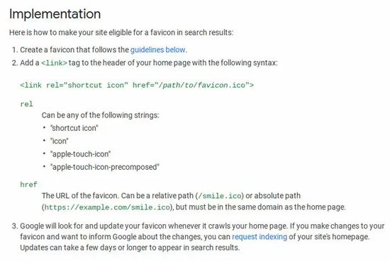
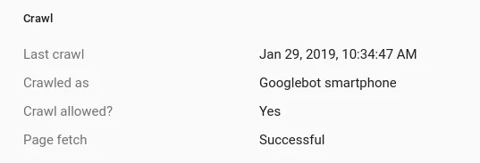
Here are the instructions from Google for adding your favicon:

Brightedge shows google instructions on adding a favicon to the mobile serp

How our community should optimize for Google mobile changes

To ensure that your brand remains fully optimized for the opportunities this change presents, we recommend the following steps.

  1. Carefully select your favicon and set it up following the steps and guidelines outlined above. This image offers you an excellent chance for branding and should not be passed over.
  2. Test how your page results appear on mobile devices to ensure that you have followed the steps properly.
  3. Use BrightEdge to monitor your clicks and traffic to see how the image placement impacts your site results.
  4. Make sure your URLs are properly optimized to contain proper keywords so that when they appear at the top of the search result, they look appealing for customers.
  5. Continue to take advantage of PPC for queries you struggle to rank for.
  6. Optimize your product listings, site descriptions, and markup so that your website is ready should Google add more search result cards or action buttons to the SERP in the future.

Google continues to look for ways to create a superior search experience for users. As the SERP changes, brands need to pay close attention to ensure that they take advantage of each opportunity presented. The opportunities from branding here should not be passed over by any organization.

Mobile-First Algorithm: Did You Make These Mistakes?

enewton@brightedge.com
M Posted 7 years 2 months ago
t 9 min read

It has been just about a year since Google first announced that they had begun their mobile-first algorithm rollout. This shift in the Google algorithm has forced a number of brands to step out of their previous paradigm of focusing on desktop users and giving some secondary thought to mobile users, and instead place their emphasis on mobile users.

Google has completed their rollout in increments, which means that not every site transitioned at the same time or that they have migrated yet. The search engine giant announced at the end of this year that just over half of all sites now are indexed through the mobile-first algorithm.

Which version of my site did Google crawl?

Google has said that they transitioned sites when their own testing indicated that the website was adequately prepared. When the site seemed ready for the mobile-first crawl, they notified the site owner through Google Search Console. If you are not sure about the status of your site, you can check through the GSC to see how your site was crawled and indexed.

You can check to see how your site was last crawled by using the URL inspection feature on GSC. After you enter the URL, you can see when it was last crawled and review the “crawled as” notation. If it reads, “google smartphone” then you know that your site has transferred to the mobile-first algorithm.

mobile-first algorithm screenshot of a crawl configuration screen

What the mobile-first algorithm means for websites

On the mobile-first algorithm, Google cares more about the mobile version of a website than the desktop version. BrightEdge research shows that across industries more users will access a site through a mobile device, forcing search engines and site designers alike to rethink how they optimize and rank websites.

Your ability to cater to these users will how impact your ranking on the SERP regardless of device. Prior to this roll out, Google used your desktop site version to rank your website across devices, using mobile compatibility as a ranking factor. Now, however, the mobile version has become their priority.

According to BrightEdge research, an estimated 62% of traffic on your site now comes from mobile devices. Customers use a variety of mobile devices, including tablets and smartphones to browse the internet and interact with brands.

Brands should note not only the growing dominance of ecommerce, but the ever-increasing percentage of these online customers who turn towards mobile devices. According to Statista, in 2018, over 63% of ecommerce was conducted from a mobile device, which totals an estimated a gargantuan $1.8 trillion.

Ensuring that your site prepares for these changes requires brands to think carefully about the mobile-first algorithm and how users will likely interact with the site. This cannot be done without a shift in thinking on the part of the web designer. No longer will brands need to design desktop websites and simply ensure that they are easily navigated by mobile consumers. Instead, we must now design mobile websites for the mobile experience.

Google's John Mueller has noted two common mistakes they see in sites attempting to prepare for the mobile-first algorithm that we wanted to call to the attention of our community.

Neglecting the proper construction of structured data on mobile versions of the website

mobile-first algorithm screencap of a google serp on mobile with local 3-pack universal listing


Google likes structured data, or schema, because it makes it easier for the search engine to understand the website, where it should be displayed, and where it qualifies for special emphasis on the search engine results page. Although many sites have set up their structured data on desktop versions of the website, they neglect the same structure on their mobile site.

The SERP today has transformed from an optimized list of websites that might answer the question the user proposed. Instead, it provides users with a variety of different information and types of content based on the understood intention for the user. People see images, videos, maps, definitions, and more in addition to a standard list of websites. These alternative formats are called universal content.

Including structured data in a website makes it easier for the search engine to understand the type of content on the page and the value it might have for potential users. When brands include it on the mobile versions of their website, they can ensure that the content will be optimally displayed. It also ensures that Google will be able to take advantage of every opportunity to display the content.

With the mobile-first algorithm, Google will examine and index only the mobile version of the website. This means that they will not take the desktop version of the website into account when they determine rankings and display on the SERPs. If your structured data on the mobile site has been neglected or set up incorrectly, it will not do your site any good.

You can learn more about including structured data through schema.org. The markup here is understood and utilized by Google, Bing (Microsoft), Pinterest, and Yandex, among others. This means that optimizing your mobile site for one major search engine will also empower your display on other search engines.

Neglecting alt tags on your mobile images

Sometimes brands will fail to verify that their alt text tags have been properly added to the mobile versions of their websites. Alt text makes it easier for Google's mobile-first algorithm to understand the value and purpose of the images on your website. Despite the power of the Google algorithm, it still cannot see images, thus it relies on the alt text to interpret your site.

Not only do alt tags help with SEO this way, but they can also improve the user experience. Namely, if a user loads your page without images, the alt tags will appear and give them some insight about what the image was intended to display. If you have users who use a text-to-voice application, such as for those users with visual impairment, the alt tag will also allow them to take in the full site experience as you initially intended.

Although most people now understand the importance of adding alt text to their standard websites, a number of people still forget to include them specifically on their mobile sites. Given that Google will now pay attention to the mobile version of the site over the desktop version, however, these sites that neglected the alt tags on their mobile sites will now find themselves missing key SEO opportunities moving forward.

To create a quality alt tag, you want to generate a brief description of the image. This description should give you a decent idea of what the image contains if you were to close your eyes and have someone describe it to you. Thus, consider the image of a group of people using cell phones below.

The alt tag, “group of young men and women outside browsing smartphones” is a better alt tag than “people on cellphones”.

Including any targeted keywords that naturally work into the description would be ideal. Keep the tag from getting too long, aim for just a few words to communicate your key ideas.

Mobile devices and their heavy usage have transformed search over the past few years. With the release of Google’s mobile-first algorithm, however, brands everywhere also have to shift how they think about their websites, design content, and create online experiences for users. As you ensure that your site has been adequately prepared for mobile-first usage, however, many brands have missed a few key steps, as Google recently pointed out. As you plan your strategy moving forward in 2019, make sure that you have corrected any instances of these errors that might occur in your website.

brightedge request a demo banner

Take Your Mobile Design Further: Responsive Design Best Practices

enewton@brightedge.com
M Posted 7 years 3 months ago
t 9 min read

The latest surveys reveal that 95% of Americans own a cellphone, with 77% owning smartphones. The sheer magnitude of mobile penetration can be amazing when you consider that the iPhone was only first released in 2007. As brands have adapted to these changes, we have seen the rise of a few different forms of mobile sites -- including responsive mobile design.

Many brands elected to choose mobile responsive design because it easily and dynamically transforms the site from desktop-compatible to mobile-compatible. To help brands create the optimal responsive design pages, there are a few best practices that can help them create engaging sites that will appear best on all devices.

1. Do not be afraid to minimize content

When designing your site, do not be afraid to minimize content. Think about how a page appears on a mobile device--pages that have too much content quickly become hard to navigate and just look busy and poorly organized, even if the content looks clean on desktop.

Instead, you want to prioritize the content that needs to appear most prominently for mobile users. This involves using a responsive mobile design from the perspective of your users. Examine the types of content that fit best with the on-the-go micro-moment. Think about what your customers will want to find on your site. Use BrightEdge to track your site traffic by device and see the pages that appear the most popular with these users.

Track mobile traffic to plan for responsive design best practices - brightedge

You can then start to organize your content so that this popular content is the easiest to find. Create drop down menus that can easily be utilized by those using fingers on mobile to navigate can help you begin to organize your material.

2. Watch mobile features

As you design your page and responsive mobile design, think about the different features that will appear on the page. At the most basic level, you want to think about the buttons that users will need. Mobile users will navigate using their fingers. This means that when buttons are too close together or too small it becomes difficult for them to access the content they want and they will likely become frustrated.

You also want to look at the images you us on the site. Each image itself should be responsive. Typically it is not a good idea to put a large, high-resolution image on the site knowing it will scale down significantly on mobile devices. This will just slow down the load time on the site significantly. Instead, you want to also use a smaller version of the image.

Consider also using scalable vector graphics for important small images, such as icons on your site. SVGs are very scalable and will always look clear, regardless of their size.

3. Think responsive mobile design first

In the past, mobile sites were the second thought for site designers -- after all most of your visitors came through desktop. Over just the past few years, however, we have seen a tremendous transformation in how people access the Internet. Now, a majority of your visitors likely arrive on mobile devices -- an estimated 62 percent. Google has rolled out its mobile-first algorithm. This means that you need to now place your emphasis on responsive mobile design first.

Consider how images appear on mobile devices when planning image size and location. Then, as the site comes together, you want to make sure you test it personally on a mobile device. You will want to think about how the site appears on a variety of different size screens, so test a few different smartphones and tablets. This will give you the best idea of how your site will look for your customers when they land on the site, regardless of their device.

4. Consider your breakpoints carefully

As you create your responsive mobile design, you want to think carefully about your breakpoints. A breakpoint is the screen size when your layout will transition from one size to the next. You will have to have at least three breakpoints, one for smartphones, then tablets, and then one for desktop.

Modern devices, however, come in a number of sizes. Some smartphones, for example, come with significantly larger screens than others. To create the best mobile user experience, you will want to consider adding more breakpoints. Generally, using 4 to 5 breakpoints can help you create optimal user experiences across all devices. This will create a higher degree of personalization, ensuring that all users, regardless of device size, get to see your site in its optimal layout.

5. Make sure you pay attention to the typography

As you create a responsive website, you also want to think carefully about the typography you use. The font should translate well across all devices. It should be easy to read on all screen sizes.

Similarly, pay attention to your text and headlines. Clearly set them apart from the rest of the text. Some mobile users also appreciate when you include a list of headlines at the top of the article and make it possible for them to click to the part of the piece they are most interested in reading.

You also want to make sure you use regular text and not text within graphics. Although the text within graphics can appear interesting, it often hinders the user experience on mobile devices. For example, many people on mobile devices want to use text-to-speech, which makes it easier for them to browse on-the-go, but this feature does not work well unless the page is constructed with standard text. The zooming feature, commonly used on mobile devices, also does not work as well when the text is embedded in the graphics instead of being written separately.

Creating a responsive mobile design for mobile users has become the primary concern of most site owners. Given the prevalence of mobile browsers and the mobile-first algorithm on Google, succeeding on mobile has become essential to site growth and engagement. Responsive mobile design remains one of the most popular site formats to ensure that sites appear correctly on all different screens. Creating a proper mobile site, however, requires brands to properly use responsive mobile design best practices to ensure that they maximize the potential of their website. Keep these ideas in mind as you plan, design and optimize your mobile site.

6 Steps to Power Your Ecommerce Holiday Marketing Strategy

gregalbuto
gregalbuto
M Posted 7 years 4 months ago
t 9 min read

The end of the year is almost here, which means the scramble to prepare for Black Friday and holiday shopping has already begun. Holiday ecommerce sales are expected to exceed $123 billion this year, which means that brands who take the time to optimize their ecommerce marketing strategy and SEO ahead of time can set themselves up for a strong run of digital sales and growth to close out Q4.

Look at ecommerce and mobile trends over the course of the year and you'll notice some important insights. Chief among these is tremendous growth in mobile shopping with ecommerce sales from mobile exceeding $30 billion in 2017, a dramatic growth from the $8 billion that was seen in 2012.

To you help you capitalize on that growth pattern, here are 6 strategies for making sure that you maximize your holiday ecommerce marketing strategy potential.

Last year’s ecommerce marketing strategy successes

Start by examining the performance of your ecommerce marketing strategy from last year. Pinpoint the strongest-performing keywords and pages for your brands. You want to look at both your traffic and conversion rates. The keywords that attracted the highest amounts of traffic and conversion will provide insight regarding what people want to read about during this particular time of year. Similarly, the pages with the best performance will let you see how well your page meets the needs of your target audience.

This data will provide you with insight regarding what people liked best. You can see the types of content and keywords that that encouraged them to convert. This information can help brands maximize the potential of the content they produce. It will guide your ecommerce marketing strategy and content creation throughout the holidays.

Look at patterns in your industry

In addition to looking at the best-performing pages and keywords from the last year, you also want to look at the current trends and patterns in your industry. This will provide you with renewed insight into what your prospective customers want to see the most. You will be able to capitalize on these interests to produce highly engaging content and shape your ecommerce marketing strategy that will serve your prospects well.

Using BrightEdge will allow you to see these trends as they emerge. Creating content immediately positions you well within your sector. You will jump out in front of the others in your industry. Not only will this help improve your ability to serve your clients, but your content will also more easily earn high-ranking positions on the SERP. As the field for a particular term and trend becomes more competitive, your content will already have the backlinks, traffic, and engagement as well as the established value that will help it rank well.

Research potential holiday-oriented keywords

In addition to emerging trends for the end of the year, you also want to look for potential holiday-oriented keywords to go after. Depending on your industry and ecommerce marketing strategy, you may find that people become interested in holiday-themed products, holiday-themed sales, or similar keyword types.

data cube research on black friday related keywords for ecommerce marketing strategy with brightedge

To find these keywords you should go back and analyze your digital sales data from last year. See if there was a standout subset of holiday or seasonal keywords that drove a significant portion of your conversions.

You should also perform keyword research. Using the BrightEdge Data Cube, you can run searches related to the holidays and your industry and uncover potential keywords that people commonly search to help drive your ecommerce marketing strategy.

These keywords will not only inform your standard content, they can also help you form ideas for your sales and holiday specials.

Build excitement for upcoming sales and specials

Use your content to build excitement and awareness for upcoming campaigns and specials. People expect sales and specials around the holidays, and they often start planning their holiday shopping early in the season.

example of holiday seasonal ecommerce marketing strategy on facebook - brightedge

Use this period to let people know about what you will offer closer to the holidays or around the big shopping days, such as Black Friday. Products that will be offered on sale can be heavily promoted for end-of-journey prospects through content, such as how-to guides, comparisons with other products, or videos with product demonstrations.

As you build these campaigns, remember also the importance of thinking in terms of a multi-channel strategy which includes ecommerce marketing strategy. Use social media to cross-promote your efforts, further building excitement for your upcoming sales and specials. Excellent product shots, engaging images with customers using the product, or even hosting contests encouraging customers to post about their experiences using particular products can help interest new potential customers ahead of the actual sales.

Once the sale does begin, add in other channels, such as your paid advertising. Promote the sale across your channels and see the value of the earlier promotion you did.

Don't forget mobile

As we mentioned, mobile ecommerce marketing strategy has seen a dramatic rise over the past few years. This year it is projected to comprise nearly 40% of all retail ecommerce. Given Google’s recent push towards mobile, particularly with their mobile-first algorithm, your mobile efforts will benefit the performance of your entire site.

Customers have become increasingly comfortable making purchases right from their mobile devices. To succeed in engaging your holiday shoppers, you need to make sure you build adequate mobile compatibility into your efforts. Each campaign should be easily viewed by people on mobile devices. This includes your content and videos you create, as some images and videos don't render well on mobile devices.

In addition to the basics of mobile optimization, however, you also want to consider creating mobile-oriented campaigns as a part of your ecommerce marketing strategy. Capitalizing on reaching customers while they are on the go can help you attract this particular target audience. You can use mobile advertising to target people within a specific geographic area or when they perform particular local searches.

How to optimize holiday ecommerce for mobile

Incorporate your mobile promotion campaigns into the rest of your campaigns. Use the above steps to build your mobile efforts.

  • Review your success from last year, specifically looking at the pages and keywords that performed best for mobile searches
  • Look for trends specifically applicable for mobile users
  • Create mobile ads and content that will encourage people to participate in the promotions while on mobile devices and keep a healthy bounce rate

Measure your progress

With the billions of dollars in revenue brands bring in during the holiday season, site owners need to pay close attention to their ecommerce marketing strategy used to drive traffic, engagement, and conversions during this critical period. Your successes and struggles this year will also have a considerable impact on how you organize your campaigns during the holiday season next year. To ensure that you collect the valuable data you will need, measure your holiday performance closely this year.

example of keyword search volume tracking for holiday ecommerce marketing strategy - brightedge

How do I measure holiday ecommerce marketing strategy progress?

  • Measure how people engage with your content
  • Look at your conversion rate and how it compares to the rest of the year
  • Examine the success of your promotional efforts for upcoming sales and promotions and how the success of that event compares to similar past events
  • Compare how your overall revenue for the holiday period appears compared to the rates you see during other times in the year

The more you take the time to plan out your campaigns and ecommerce marketing strategy during this critical season, the easier it will be see the success you want. Consider how these steps can boost your own efforts throughout the end of the year and use digital marketing to drive your ecommerce holiday marketing success.

Get the BrightEdge Ecommerce Holiday Shopping Trends research report!

The New Google Search Console: Mobile Compatibility and Link Reports

enewton@brightedge.com
M Posted 7 years 7 months ago
t 9 min read

The search engine giant announced last week that they would be adding additional features to their new Google Search Console (GSC).

This new Google Search Console was initially released in beta to a few users at the end of 2017 and then rolled out to all users beginning in early 2018. The initial beta version initially included the most popular functions, including search performance, index coverage, AMP status, and job posting. Google announced their intention to continue to add more features throughout the year. These latest features are imports from the old Search Console.

Features on new Google search console - brightedge

As the company has said about their new Google Search Console:

“The new Search Console was rebuilt from the ground up by surfacing the most actionable insights and creating an interaction model which guides you through the process of fixing any pending issues."

If you noticed some changes as you logged into the new Google Search Console, we have outlined what you should know.

What you will find in the new Google search console

Links Report

On the Links Report, you will be able to easily see both the inbound links to your site as well as the internal links between your pages as Google search sees them. This report will combine the insights that you used to see in the “Links to your Site” feature and the “Internal Links” that you saw on the old search console.

You will also be able to gain valuable insights from this new Google Search Console report such as:

  • Which sites link to your domain the most
  • Which specific pages on your domain receive the most links
  • The text that commonly points to your site

Example Links Report from new Google Search Console

Why does the Link Report matter?

Inbound and internal links play valuable roles in SEO.

Inbound links let Google gain a better idea of how other people view your site. Sites generally viewed as reputable and valuable will receive more inbound links than others. Quality inbound links, therefore, will give the Google algorithm a good idea of how people view your material.

Helpful links can also drive traffic to your site.

People link to your site because your content would give valuable information for their users. If those readers want more information, they will click on the link, therefore bringing more readers to your domain.

Internal links help both people and search spiders enhance their navigation of your site. They will keep people engaged by encouraging them to visit additional pages relevant to their topic of interest. They will better explore the depth your site offers and begin building that important relationship of trust.

Internal links will also help search engine spiders navigate the site. They will see clearly how the different pages connect together and get a better idea of the value and depth you offer. This can help improve your standings in the SERP. They will also help to ensure that no pages of your site are overlooked by the spiders, so everything gets indexed regularly and remains updated.

Mobile Usability report

The Mobile Usability report on the new Google search console will contain issue names consistent with the ones that appeared in the old report. It will also have a new feature, however, allowing GSC users to submit a “validation and reindexing request.” If Google highlights an issue on the mobile usability of your site and you correct the problem, you can then use this request to let Google know the problem has been corrected. Given the importance of mobile in today’s search algorithm, correcting these issues as quickly as possible will be critical.

Example of mobile usability report on new Google Search Console - brightedge

Google has placed a large emphasis on mobile users in recent years. The search engine giant points to the high levels of smartphone saturation, including that in a number of countries, there are more smartphones than personal computers.

Given the number of people who currently use mobile devices to access the internet, brands need to have confidence that these readers can easily engage and interact with the website. Pages that do not conform to Google’s’ mobility-usage recommendations may use small fonts, force people to zoom in on the page, or otherwise not fit the screen, causing a poor user experience.

Why does the mobile usability report matter?

Google has placed a considerable amount of emphasis on usability for mobile users over the past few years. They used mobile compatibility as a ranking factor beginning over 3 years ago with the Mobilegeddon update in April 2015. Beginning at the start of 2018 they also began rolling out their mobile-first algorithm, which looked at the mobile version of a website first when determining the ranking of pages on the SERP.

This report within the new Google Search Console will provide important information for users so they can remain confident that their site does not contain mobility-usage errors. Failing to uncover and address such errors could easily result in a drop in rankings as well as a poor user experience for a number of potential visitors.

What does mobile usability mean?

Sites that rank highly in their mobile usability provide easy navigation for users on-the-go.

You want to think about the page-load speed, text, images, and other visual content you produce. Make sure it appears easily on mobile devices. Small font sizes or fancy designs that make it hard to read will both detract from the mobile user experience as will videos and images that do not display on mobile devices.

You also need to think about the buttons you use. People on mobile devices generally navigate using their fingers. Navigation features, such as your menu or arrows, should all have enough space in between them that mobile users can easily click where they intend.

Mobile friendliness also includes developing layouts and content that assists on-the-go visitors with finding the information they seek. Google, for example, has found that 94% of people on smartphones use them to find local information. Creating content that addresses these local intentions and anticipates what people want to see will produce higher engagement rates.

With the new Google Search Console, Google continues to work towards an improved user experience, and that includes giving site owners the tools they need to improve the usefulness of the content they produce. Through using these features, you will have greater insight into your site’s performance and what you can do to boost it with the help of the new Google Search Console and the BrightEdge SEO platform.

request a demo cta banner

Winning Mobile with Smart Content and AMP

A BrightEdger
A BrightEdger
M Posted 8 years 1 month ago
t 9 min read

Mobile continues to gain momentum. In our 2017 mobile study, we found that 57% of all online traffic occurred on smartphone and tablet devices. Consumers and, to a lesser degree, business buyers have been selecting mobile as their platform of choice when interacting with brands and sites. Given the importance of mobile as a marketing touch point, it’s critical to ensure that website pages render well on mobile and tablets. And since search engines list different content on their mobile search result pages than they do for desktop searches, it’s critical to pay attention to how your content performs organically on different devices and optimize it for mobile experiences. brightedge mobile search for smart content and amp 
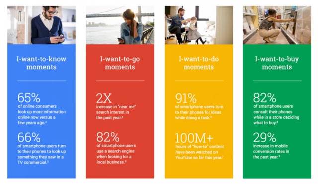
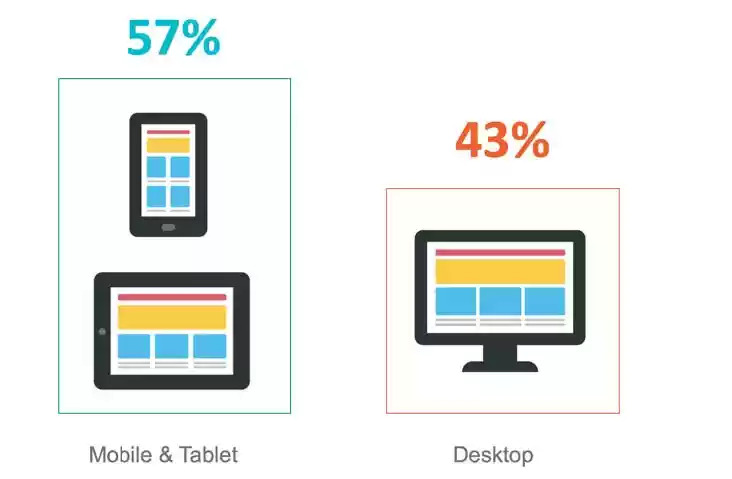
In other words, marketers and SEO pros should take on-the-go content consumption into serious consideration.

One noteworthy development in mobile is the increase in frequency of voice search adoption where customers speak their search queries into their mobile device. Marketers can take concrete steps to optimize content for voice search. The other development in mobile is the introduction of Accelerated Mobile Pages (AMP), which, once implemented, accelerates page loads on mobile devices. AMP improves the experience of users on the go by reducing the weight of HTML pages. Google hosts AMP files on its own content delivery network (CDN), which accelerates page loads even further; users experience AMP content as if it’s loading from the browser cache as opposed to being pulled from a remote server. Read the BrightEdge POV on AMP for more information. For a while, AMP was thought to benefit only publishers - especially news organizations - since Google was promoting news articles on a carousel on top of mobile SERPs. But now it’s becoming more generally accepted that AMP can benefit other industry verticals. Instructions on implementing AMP for ecommerce sites, for instance, are in demand. Separately from mobile, we’ve been advising brands to re-evaluate their approach to content ideation and development overall. We developed a new framework, called Smart Content, that aids brands in accelerating performance from content by developing content that’s pre-optimized for search, mobile, and user experience - and activating content faster.

Why do Smart Content and AMP make sense together?

The guidance to develop AMP versions of standard content items is part of the Smart Content framework. The framework introduces a checklist of steps that content writers, strategists, and marketers should take to increase content performance and ROI by targeting demand, empowering the marketer, and delighting the reader. AMP is one of the checklist items that fall into the third category. Delighting the reader has a lot to do with page load performance. In addition to recommending AMP, the Smart Content framework calls for the optimization of page images and other artifacts to accelerate page load in mobile browsers over slow connections. Brands should reduce image size without compromising quality. Similarly, they should unify, minimize, and compress JavaScript files as well as CSS files to speed page loads. It may be difficult to identify heavy and slow-loading website pages, especially on large websites that include collections of heterogeneous content that were developed and maintained on separate domains or content management systems. Brands can leverage site auditing solutions that examine page size and page load speed to flag and optimize heavy pages quickly and at scale.

What are key considerations for implementing Smart Content and AMP?

Ready to implement Smart Content and AMP? Then there are a few things that you should keep in mind. AMP content does NOT replace standard content; it augments it. You still need to develop standard HTML pages for your non-mobile traffic. And, ideally, your standard HTML pages should be responsive to accommodate mobile traffic with smaller form factors outside of AMP.  

Should you decide to adopt AMP then you should do so consistently. You get a bigger bang for the AMP buck if more site content is available as AMP. For large sites with thousands or millions of pages, manually creating AMP files is not realistic. Look for technology solutions that can automate the creation of AMP versions as new content gets created. The AMP page and the canonical page should point to each other so that search engine bots can quickly find them and decide when to use each one. Use link tags to do the bi-directional pointing.

Add to the canonical page this tag: <link rel="amphtml" href="https://www.mysite.com/url-of-amp">

Then add to the AMP page this tag: <link rel="canonical" href="https://www.mysite.com/url-of-canonical">

Lastly, the Smart Content framework calls out for continuous optimization of content. Whether it’s dynamically improving the list of content recommendations when better content is available or automatically implementing new SEO best practices, content must be regularly optimized to ensure it continues to outperform the competition and pull in new visitors. The same approach must be taken with AMP content. AMP items must be regularly attended to just like the standard pages.

How do I maintain a comprehensive picture of content performance?

As more traffic is generated via AMP pages, it’s important to attribute appropriate credit to AMP for website traffic, conversions, and revenue. Given the reporting limitations that AMP imposes, it’s critical to ensure that AMP pages are appropriately tagged with web analytics to capture page visits and events. Brands must also ensure that they correctly unify AMP and non-AMP traffic in their analytics reporting. They must have a 360-degree view of content performance regardless of the format or delivery mechanism of the content. Some marketers may want to sum up AMP and non-AMP traffic for a particular content piece, while others may want to dive into the details of each. It’s important to enable both data aggregation as well as slicing and dicing across AMP and non-AMP items. AMP should be viewed as a tactic to improve user experience, content discovery, and performance. It is hard to say whether AMP is a final or intermediate step in a bigger effort to make digital content load and engage customers quickly. Because of that, it’s important to pick a marketing platform that future-proofs user experience tactics. Look for one that automates AMP creation, with AI-powered machine learning ideally, for today, but one that can also shift course and batch-correct your content should an updated or new standard or approach emerge.

Smartphone and Desktop Search Results Diverge Further

enewton@brightedge.com
M Posted 9 years 4 months ago
t 9 min read

In June 2014, BrightEdge research on the mobile opportunity revealed that “On average, 62 percent of organic searches show different results depending on whether the search was performed on a desktop or smartphone.”

Knowing that organic search results are different on desktop computers or smartphones is important because content which is believed to be optimized for high rankings on desktops may in fact rank differently or poorly on smartphones.

For marketers, not ranking highly on smartphones results in lost opportunities to reach and engage audiences. Brands which did not rank well on smartphones in 2014 were at risk of missing up to 25% of their customers because smartphones, as a channel, were 25% of device traffic.

In 2016, smartphones are the majority of device traffic and optimizing for mobile content is no longer a choice. Is your site optimized to rank on mobile keywords? Watch our webinar on Google's Mobile Algorithm Change to find out how to do it effectively.

Search results and mobile searchers

As smartphones have grown in importance, Google’s search results have evolved to be relevant to predominantly mobile searchers. Google is aligning their mobile content to deliver a great experience, matched to mobile searcher intent, by showing mobile searchers different results from what a desktop search would yield.

The differences between desktop and smartphone results have increased markedly as the share of mobile searches has increased. BrightEdge research shows that as of October 2016, 73 percent of organic searches now show different results based on the device used to perform the organic search.

This is a marked increase from 2014: Two-thirds of search results were different back then but now three-quarters of search results are different. Effectively, smartphone searchers are receiving different results from desktop searchers.

BrightEdge expects the difference in results to increase further as Google works to optimize the relevance of the content it presents to its users.

The takeaway from this research update? Brands must optimize content for multiple devices in order to compete for and win customers on any device, be it smartphones, tablets, or desktops.  

request a demo

Mobile SEO: Scaling your mobile marketing efforts

Default avatar
gerald
M Posted 9 years 8 months ago
t 9 min read

When 91% of people have their mobile phone within a 3-meter radius 100% of the time, businesses need to evaluate the importance of mobile SEO and devising and successfully executing a mobile marketing campaign. Additionally, there are now more searches carried out on Google on smartphones than there on tablet and desktop devices combined. Add this to the recent behavior associated with the finding of information through micro-moments, AMP, and the expected enhancement of Google's algorithm, it is clear that mobile SEO and on-the-go marketing should be carefully considered and addressed in your marketing roadmaps. Micro Moments are important in mobile SEO - brightedge  

But first - mobile marketing may not suit every business. The first thing you need to do it get a device breakdown by visits and revenue to see which devices your visitors are using. This will determine the impact of implementing for your website. On the BrightEdge platform, this can easily be done through StoryBuilder. There are several options available to help you understand your audience, including 'How well is mobile driving traffic to my site?' and 'What part of my site received the most mobile traffic?' It may be that you need to rewind and develop a more robust content marketing strategy by using personas so you know who your audience is, in the first place.

Mobile SEO and marketing

There are a few requirements before you can successfully begin mobile SEO optimization:

  • A responsive website is fundamental so your website is displayed in the best possible way for all potential devices
  • Fast mobile loading times, which is not only likely to grow in algorithm weight in the coming months, but also provides a positive user experience
  • Analytical software so you can allow data to be the compass of your mobile SEO campaign

Once you have identified that you have a mobile audience who engages with your content and products, it is time to grow this audience through mobile SEO and marketing.  

Mobile SEO and content marketing

Earlier we discussed how to determine if your audience engaged with mobile or not, there are some instances when this may not be the case. For example, sole eCommerce websites, with limited informational content, might virtually only have an I-want-to-buy audience. Now we need to dig deeper. The first step we need to take is 'audience metrics'.  

Publishing mobile marketing content

Effective mobile content marketing should be published to suit your audience, not you. To do this, go to your analytic software and filter the results down by day and hour-of-the-day as well as by device. This will show you when, and by what device, your audience is viewing your website's content. Is it the case that your mobile audience is at a peak on Tuesday's before the rush hour at 8am? This is the time you need to publish more mobile-friendly content to strengthen your mobile marketing campaign. Mobile-friendlier content can include:

  • Making more use of bullet points to aid with content scanning. Writing a quick summary can also help with I-want-to-know moments
  • Write succinctly. Quick information is quality information
  • Enable easy social sharing icons to encourage content sharing and reach
  • Think about content formats. Are you reaching an audience interested in scanning a quick blog post on the train to work? Are you catching people along in their offices enjoying watching videos with their morning coffee? The intent journey is fundamental to mobile SEO.
  • Optimize for mobile keywords, such as voice search and long tail keywords

More in-depth information can be found in Search Engine Watch's Handy Guide to Mobile Content Marketing.  

Why are mobile and desktop rankings different?

Whenever we carry out a search, two systems are considered: paid and organic. We found in a recent study that paid, otherwise known as PPC, searches 4-pack results were triggered for 23% of all queries. One of the huge advantages of organic search is that it is triggered for every single query - it's no surprise that SEO makes up 51% of traffic for most web sites. When it comes to organic search, several indexes are often searched and displayed on one SERP. When we type in a query, the top results from relevant indexes are displayed on one interface. If you do a search for 'San Mateo,' for example, regular web listings and images are extracted and the top results of each has a place on the SERP.  

Mobile and desktop keyword rankings differ because the ranking signals are different. On mobile these are often referred to as citation signals whereas on desktop these are referred to as ranking factors. Note, that soon mobile will have its own index, but for now it runs off the same web search index that desktop uses. To gain a higher presence using mobile marketing, for example, customer ratings play a part whereas on desktop this is not the case. It is important also to not forget that physical distance plays a role on mobile ranks. Mobile searches tend to display more local information which can push regular web listings further down the SERP. For these reasons mobile and desktop rankings are different.  

Local SEO citation signals

Summary available below, more explanation is given here:

  • On-page metadata

Carry out localized keyword research, constantly thinking of local dialect terms and phrases to strengthen your advanced on-page seo and insert these, naturally, in the places where search engines look, such as titles, headers, body of text etc.

  • Name, Address, Phone (NAP)

An essential requirement of mobile marketing, and Local SEO, is to have a physical address. Local SEO is very effective at increasing footfall into stores which your staff can help to convert into customers just as placing a buy button on a website does.

  • Google+

Register for Google My Business and to ensure efficiency, use the bulk upload feature. Register each of your stores with their unique information. And like metadata, use local dialect in the descriptions etc to make the content and location as relevant as possible.

  • Reviews

Encourage your customers to write reviews for your stores. There are lots of tactics in which you can do this. If you are a BrightEdge customer, ask one of our Client Service Managers or Professional Services Managers to advise you on this. Mobile SEO and mobile marketing are an important part of a thorough digital marketing strategy for many brands. Understanding the impact of mobile on your business and how to optimize your site and content for on-the-go users can help you grow your brand and your reputation.  

3 Common Technical Mobile Site Errors that Can Damage Organic Traffic

dpatel
dpatel
M Posted 10 years 10 months ago
t 9 min read

Technical recommendations to avoid mobile site errors

Given the focus on mobile this spring, you have probably done the mobile optimization basics:

  1. Created a mobile or responsive site
  2. Tested your site for mobile-friendliness and looked for the Mobile-Friendly tag in your mobile SERPs
  3. Make sure your mobile site loads fast with the Page Load Speed tester

When websites do not have mobile-specific sites, then mobile devices often try to load the standard desktop site. This can lead to problems such as:

  • content not loading
  • difficulty reading content
  • user frustration and dissatisfaction
  • high bounce rates

These mobile site errors are the effects that Google and mobile-friendly companies want to avoid.

Although responsive sites, websites that automatically adapt to the size screen where they are displayed, have become increasingly popular, a number of companies also use distinct mobile versions of their websites. These websites are designed to automatically direct the user from the main desktop website, such as website.com, to the mobile version of the website, such as m.website.com.

Unfortunately, not all websites built this way have been coded correctly. There are a few very common mobile site errors that have appeared on client websites that could be hurting the user experience, the ranking of the site, and even the company’s bottom line.

investigate Mobile site Errors with brighetdge

Neglecting to provide proper signals for Googlebots

Google expects web developers to establish signals between the parent site and the mobile site. These simple bits of code will let the search engine know about the relationship between the two sites so that they can be treated as one entity by the search algorithm instead of two. Failure to use the proper signals could result in the Google algorithm mistaking the mobile version of the page as a separate website. This can impact ranking. With the heavy emphasis placed on websites being mobile friendly after April 21, 2015, websites that do not have the relationship correctly indicated could also be mistaken as not being prepared for mobile users.

If you have covered the basics, you are ready for the more advanced mobile optimizations, particularly if you have a dedicated mobile site. Check and optimize the following to avoid common mobile site errors:

  1. Redirects between desktop and mobile
  2. Allow access to JavaScript, CSS and Robots.txt
  3. Fetch as Googlebot to confirm accessibility and rendering

1) Redirects: What the signals are supposed to look like

Google asks that websites maintain bidirectional annotations (meaning that they go on both versions of the website) and that there is a 1-to-1 ratio between the mobile pages and a corresponding desktop page. For a desktop page, using the example http://www.example.com/page-1, Google says the HTML annotation added should like this:

Desktop Redirect for Google mobile site errors - brightedge

On the mobile version of the website, Google then says that annotation should read:

Redirect for mobile site errors on Google - brightedge

Google also supports including the annotation in the sitemap for the desktop page, which would then be written like this:

Desktop Redirect Sitemap for Google mobile site errors - brightedge

Companies should review their annotations to make sure that they fit the format required by Google to avoid having ranking problems with the search engine giant.

Mobile site errors with proper redirects

Google and users expect websites that have separate mobile sites to automatically redirect them to the corresponding mobile sites. While there are a few mobile site errors that can arise from improperly using mobile redirects, there are two that we have seen regularly. Both of these problems can cause a poor user experience and hurt the company’s reputation.

  1. Neglecting to have certain pages within the website built in a mobile format so that multiple desktop pages redirect to a single mobile page.

These mobile site errors can be particularly troublesome for companies that neglect to create mobile pages for their high-traffic pages. Given that more than half of organic traffic comes through mobile devices, failing to have high traffic and high conversion areas of the website optimized for mobile will seriously impact leads and revenue.

  1. Having the redirects improperly configured so that some content does not appear at all for users.

If the redirects are not properly configured, it can result in the information being improperly displayed or not displayed at all. A mobile device might attempt to display the page designed for a desktop screen, which is hard for users to read and will lead to increased frustration. If the mobile device cannot display the information at all, users will also move on to the next website.

Redirect configuration guidelines and considerations

Google accepts both HTTP redirects and JavaScript redirects. When using HTTP redirects, both 301 and 302 status codes can be used, although 302 is strongly preferred.

Those considering using JavaScript redirects should carefully consider the potential latency that can be caused by these codes. Generally, the user’s device will need to download the page to then reach the JavaScript command to redirect, which can result in longer wait times and higher bounce rates.

2) Allow Access to JavaScript, CSS and Image Files

Google recommends allowing Googlebot direct access to JavaScript, CSS, and image files used by your website so that Googlebot can see your site like an average user. If your site’s robots.txt file disallows crawling of these assets, it can inhibit indexing of your content. This can result in suboptimal rankings.

Google recommends concatenating (merging) your separate CSS and JavaScript files, minifying the concatenated files and configuring your web server to deliver the compressed files, usually gzip compression.

3) Fetch as Googlebot to Confirm Google’s View

Make sure that Googlebot can crawl your JavaScript, CSS and image files by using the “Fetch as Google” feature in Google Webmaster Tools. It will allow you to see exactly how Googlebot sees and renders your content, and it will help you identify and fix a number of indexing issues and other mobile site errors.

Fetch mobile site errors as Googlebot - brighetdge

Check and test your robots.txt in Google Webmaster Tools and look for errors and warnings. If you use separate URLs for your mobile pages, make sure to test both the mobile and the desktop URLs, so you can confirm that the redirect is recognized and crawlable.

Properly constructing mobile pages to align with the desktop page is critical for site success. Mobile optimization is now required for sites to compete with the high amount of organic traffic originating on mobile devices as well as the emphasis Google has placed on websites being mobile-ready.

Those who have developed separate mobile sites should carefully review their configurations to ensure that their sites do not contain any of the errors described above.

  request a demo

BrightEdge Customers: Prepared for Mobile Optimization Since 2013

Jim
Jim
M Posted 11 years ago
t 9 min read

Since 2013 BrightEdge customers have been prepared for the massive mobile shift. BrightEdge was the first to release Mobile search technology way back in March 2013 with mobile and tablet ranking analysis. In August 2013 we built upon this innovation with Mobile Share of Voice and Mobile Site Audit. The BrightEdge platform has been making it easier for customers to optimize and measure mobile performance ever since.

Innovation, customer success and the BrightEdge mobile solution

At BrightEdge our core value is customer success and this value is reflected in the market leading innovations that we continually deliver in our platform. As a leading SaaS technology provider, BrightEdge has delivered over 85 product releases to-date -- all delivered seamlessly to customers accounts without any user action necessary.

BrightEdge has continuously paved the way with technology and research to assist brands in mapping a mobile search strategy.

In 2014 our mobile research found that 62% of search results vary from mobile to desktop and that tablets and smartphones make up 35% of organic search traffic. See how it's helped out customers:

“With BrightEdge’s Mobile SEO we’re able to grow our mobile performance month over month, and it’s a great win for us internally because we’re able to visually understand how mobile is performing by device type across our channels”  - Experian

“From a travel and hospitality perspective, mobile is seeing a tremendous amount of growth. For Marriott we need to make sure that we’re on top of our game from a mobile perspective and BrightEdge visibility will definitely help us” - Marriott    

2015 - BrightEdge customers are ready for the Google mobile algorithm update

Fast forward to 2015 and knowing how to optimize your site for mobile requires a deep understanding of the experience your site is creating today in order to make improvements for tomorrow.

Many brands are concerned about the impact of Google’s mobile algorithm update.

Meanwhile, BrightEdge customers have had technology in place for two years to help them understand their rank and the competitive landscape across 605 local, global and mobile search engines - equipping them to win in the competitive mobile battleground.

BrightEdge takes mobile search solutions beyond the webmaster and to the marketer with a comprehensive offering that helps brands understand their organic search and content performance by device.

The BrightEdge Mobile solution allows users to track and measure mobile device performance by:

  1. Tracking and reporting on keyword trends and rankings across device type (desktop, mobile, and tablet).
  2. Measuring actual rank by device in Universal Search with Blended Rank (image, video, social, quick answers, and local 3-pack).
  3. Providing visibility into local organic performance by keywords and keyword groups across cities.
  4. Understanding mobile readiness by providing marketers with a complete Mobile Site Audit.
  5. Optimizing and understand actual mobile performance based on a deep integration between BrightEdge and mobile analytics.
  6. Understanding the competitive organic landscape and Share of Voice for a brand across mobile devices.

The entire BrightEdge platform is mobile aware. Whether you are looking at actual business performance, rank, or competitive performance – mobile is integrated throughout the BrightEdge platform.

The dashboard overview image below illustrates the BrightEdge mobile search solution.

BrightEdge Mobile Search Solution  

Conclusion

BrightEdge customers have been prepared for mobile search optimization since 2013 and our commitment to customer success and market leading innovation equips marketers with the insights and recommendations necessary to succeed with mobile search.

As part of a new ‘mobile solution’ blog post series BrightEdge will be taking a deeper dive into the platform mobile solution as per points 1-6 above. Stay tuned for more over the coming weeks.

Read more about mobile optimization on the BrightEdge blog:

,