Technical recommendations to avoid mobile site errors
Given the focus on mobile this spring, you have probably done the mobile optimization basics:
- Created a mobile or responsive site
- Tested your site for mobile-friendliness and looked for the Mobile-Friendly tag in your mobile SERPs
- Make sure your mobile site loads fast with the Page Load Speed tester
When websites do not have mobile-specific sites, then mobile devices often try to load the standard desktop site. This can lead to problems such as:
- content not loading
- difficulty reading content
- user frustration and dissatisfaction
- high bounce rates
These mobile site errors are the effects that Google and mobile-friendly companies want to avoid.
Although responsive sites, websites that automatically adapt to the size screen where they are displayed, have become increasingly popular, a number of companies also use distinct mobile versions of their websites. These websites are designed to automatically direct the user from the main desktop website, such as website.com, to the mobile version of the website, such as m.website.com.
Unfortunately, not all websites built this way have been coded correctly. There are a few very common mobile site errors that have appeared on client websites that could be hurting the user experience, the ranking of the site, and even the company’s bottom line.

Neglecting to provide proper signals for Googlebots
Google expects web developers to establish signals between the parent site and the mobile site. These simple bits of code will let the search engine know about the relationship between the two sites so that they can be treated as one entity by the search algorithm instead of two. Failure to use the proper signals could result in the Google algorithm mistaking the mobile version of the page as a separate website. This can impact ranking. With the heavy emphasis placed on websites being mobile friendly after April 21, 2015, websites that do not have the relationship correctly indicated could also be mistaken as not being prepared for mobile users.
If you have covered the basics, you are ready for the more advanced mobile optimizations, particularly if you have a dedicated mobile site. Check and optimize the following to avoid common mobile site errors:
- Redirects between desktop and mobile
- Allow access to JavaScript, CSS and Robots.txt
- Fetch as Googlebot to confirm accessibility and rendering
1) Redirects: What the signals are supposed to look like
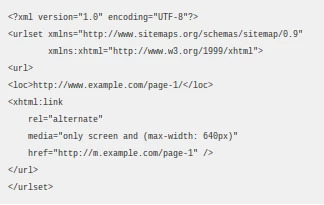
Google asks that websites maintain bidirectional annotations (meaning that they go on both versions of the website) and that there is a 1-to-1 ratio between the mobile pages and a corresponding desktop page. For a desktop page, using the example http://www.example.com/page-1, Google says the HTML annotation added should like this:

On the mobile version of the website, Google then says that annotation should read:

Google also supports including the annotation in the sitemap for the desktop page, which would then be written like this:

Companies should review their annotations to make sure that they fit the format required by Google to avoid having ranking problems with the search engine giant.
Mobile site errors with proper redirects
Google and users expect websites that have separate mobile sites to automatically redirect them to the corresponding mobile sites. While there are a few mobile site errors that can arise from improperly using mobile redirects, there are two that we have seen regularly. Both of these problems can cause a poor user experience and hurt the company’s reputation.
- Neglecting to have certain pages within the website built in a mobile format so that multiple desktop pages redirect to a single mobile page.
These mobile site errors can be particularly troublesome for companies that neglect to create mobile pages for their high-traffic pages. Given that more than half of organic traffic comes through mobile devices, failing to have high traffic and high conversion areas of the website optimized for mobile will seriously impact leads and revenue.
- Having the redirects improperly configured so that some content does not appear at all for users.
If the redirects are not properly configured, it can result in the information being improperly displayed or not displayed at all. A mobile device might attempt to display the page designed for a desktop screen, which is hard for users to read and will lead to increased frustration. If the mobile device cannot display the information at all, users will also move on to the next website.
Redirect configuration guidelines and considerations
Google accepts both HTTP redirects and JavaScript redirects. When using HTTP redirects, both 301 and 302 status codes can be used, although 302 is strongly preferred.
Those considering using JavaScript redirects should carefully consider the potential latency that can be caused by these codes. Generally, the user’s device will need to download the page to then reach the JavaScript command to redirect, which can result in longer wait times and higher bounce rates.
2) Allow Access to JavaScript, CSS and Image Files
Google recommends allowing Googlebot direct access to JavaScript, CSS, and image files used by your website so that Googlebot can see your site like an average user. If your site’s robots.txt file disallows crawling of these assets, it can inhibit indexing of your content. This can result in suboptimal rankings.
Google recommends concatenating (merging) your separate CSS and JavaScript files, minifying the concatenated files and configuring your web server to deliver the compressed files, usually gzip compression.
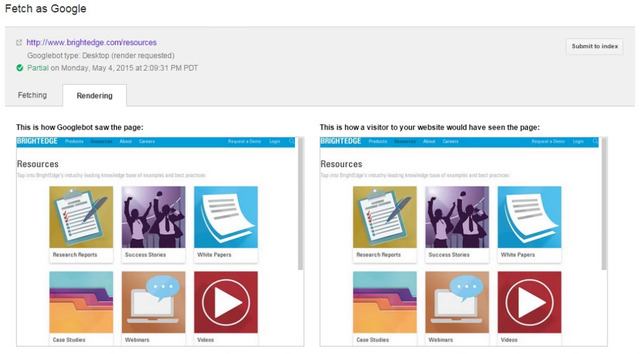
3) Fetch as Googlebot to Confirm Google’s View
Make sure that Googlebot can crawl your JavaScript, CSS and image files by using the “Fetch as Google” feature in Google Webmaster Tools. It will allow you to see exactly how Googlebot sees and renders your content, and it will help you identify and fix a number of indexing issues and other mobile site errors.

Check and test your robots.txt in Google Webmaster Tools and look for errors and warnings. If you use separate URLs for your mobile pages, make sure to test both the mobile and the desktop URLs, so you can confirm that the redirect is recognized and crawlable.
Properly constructing mobile pages to align with the desktop page is critical for site success. Mobile optimization is now required for sites to compete with the high amount of organic traffic originating on mobile devices as well as the emphasis Google has placed on websites being mobile-ready.
Those who have developed separate mobile sites should carefully review their configurations to ensure that their sites do not contain any of the errors described above.
