
 campaign, each one giving you information about customers at a particular stage.
 information online, and that number continues to grow. You can also see support for this strategy by considering that small businesses with blogs get 126 percent more lead growth than those without, according to the CMI.
 THE RESULTS
 spread across the digital ecosystem.
<p class="rtecenter">Thank you for registering for the BrightEdge Women in Tech Mentorship Program. We will be in touch with you soon!</p>
Publication Dates Matter for SEO Freshness

M
Posted 7 years 3 months ago
t
9 min read
Why is publication date important?
When Google determines which websites are the most relevant to a particular query, two criteria examined is the publish date and date on the page. Particularly for time-sensitive queries, such as news articles, the publication date will have a huge impact.
Take, for example, the query, “Google’s algorithm update.” Considering that Google regularly updates their algorithm, the searcher will most likely want to see information regarding the most recent major update. As of the writing of this piece, that would be the March 2019 Core Update or the Florida 2 update. When a person makes this query, these are the results that they want to see.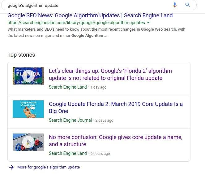
The Google Panda update was another major update that attracted significant attention several years ago. The sites covering that update have likely amassed a number of backlinks and high traffic rates. Their publication date, however, is one clear indicator that they do not discuss the update the user wants to see. Therefore, even though they might have more backlinks than the recent articles, the recent articles receive precedence.
Given the importance of dates in determining relevance, it is clear that they can therefore impact SEO. Marketers should also note that for many queries, Google also displays the date of the content next to the listing on the SERP. This influences whether or not people will want to click on a particular article, thus impacting your click-through rate and the prospects you can bring into your sales funnel.
Understanding how Google determines dates, therefore, and what you can do to make sure Google has the right one, can impact how you structure your pages. Google recently spelled out their methodology, and we wanted to dive into it with our community.

 How does Google determine the date on the page?
Google reports that they use a variety of factors when determining the date of a page. The spider automatically looks for any prominent listings on the page that might clearly state when the content went live. It also checks the structured markup or schema of the page to see if a date has been noted. The search engine does not limit itself to these methods, however, and can also use other means of examining pages and determining the publication date.
The search engine reports that they use several different methods to reduce the potential for error. Sometimes publishers do not include a clearly listed publication date or their structured markup might not be generated correctly. By looking at several factors, it becomes easier for the search engine to make the most accurate determination.
General SEO best practices for specifying a date on a page
To make sure that Google interprets your page’s date correctly, there are two main steps you can take as you design your site.
One, list a clear publication date on the page. Secondly. use structured data with the datePublished or dateModified markups to help Google best understand when your page was published or updated.
If you find that Google interprets your date incorrectly, look closely at the content on the page. Keep and eye out for any potential prominent dates that might be confusing the search engine. If you can remove them, do so.
As you do promote your dates throughout your website, keep your methodology consistent for all the pages. For example, keep the date the page went live listed in a consistent spot and manner on all of the pages.
Special content date situations to note
Keep in mind that depending upon the type of content you create, Google might also have additional criteria to remember as you promote your date. For example, on news stories, Google reminds publishers to make sure that you follow the Google news rules regarding the dates listed in articles. In other words, you must have a clear date and time of publication and can only list updated times if the article has been substantially updated.
Google also reminds site owners that if they are promoting an event, they should make it clear on the page when and where the event is, but keep the publication date separate. The date of the event should not be listed as the publishing date for the content.
For anyone who updates a piece of content, you can list an update publication date, making it clear to users when the piece was originally published and when it was updated. Structured data makes this easier for search engines to interpret with the datePublished and dateModified markups.
Should you create new content or modify existing content?
With this discussion of dates, it becomes a natural discussion to then look at whether or not content should be updated or if new content should be created. Anyone considering their options should think about the questions below.
1. Is your content useful? Ask yourself if the content you want to update is still largely useful for users and just requires some small adjustments to take into account the latest developments. Content still relevant for users can generally be updated with a new publication date and serve the targeted audience well.
2. What is the traffic rate and the SERP ranking for the page? A page that still receives a solid stream of traffic and rankings well generally benefits more from an update than fresh content. Your fresh content would then have to compete with your old content for visibility, and you want to make sure that people who land on your old content receive the latest information.
3. Does my content fit? Look at how this piece of content fits in with the rest of your content structure. For example, if you are working to build a content cluster, would drafting new content help you to build you your pyramids and establish your authority better?
4. How much of an update does the page need? If the update will result in you redrafting nearly the entire piece of content, then creating a new piece might serve you better. If you do create a new piece, you will want to use a 301 redirect from the old piece to maintain the link equity benefits. If, on the other hand, you will only need to update a small paragraph, writing an entire new piece might end up with a considerable amount of repetition.
If you do end up creating a new piece of content to reflect the latest updates in the field, it can be helpful to put a link at the top of the original piece to let people know where they can go for the latest information about the topic.
Content dates can benefit not only your SEO, but also how many people click through from the SERP. Making sure Google interprets your page’s publication date, therefore can be an important step. Make sure your pages have been consistently created with the correct date promoted and weigh carefully the needs of updated content versus new content as you build your content calendar moving forward.


 This is why it is so critical to ensure that your business shows up in Google’s Local 3-pack: the trio of nearby businesses that dominate the search engine results page (SERP) of 23% of local-focused mobile searches, according to BrightEdge research. When a local 3-pack is displayed on mobile, 55% of the clicks are for one of the three listings. If your business is not featuring there, you’re immediately missing out on half your potential audience.