
Mobile-First Algorithm: Did You Make These Mistakes?

It has been just about a year since Google first announced that they had begun their mobile-first algorithm rollout. This shift in the Google algorithm has forced a number of brands to step out of their previous paradigm of focusing on desktop users and giving some secondary thought to mobile users, and instead place their emphasis on mobile users.
Google has completed their rollout in increments, which means that not every site transitioned at the same time or that they have migrated yet. The search engine giant announced at the end of this year that just over half of all sites now are indexed through the mobile-first algorithm.
Which version of my site did Google crawl?
Google has said that they transitioned sites when their own testing indicated that the website was adequately prepared. When the site seemed ready for the mobile-first crawl, they notified the site owner through Google Search Console. If you are not sure about the status of your site, you can check through the GSC to see how your site was crawled and indexed.
You can check to see how your site was last crawled by using the URL inspection feature on GSC. After you enter the URL, you can see when it was last crawled and review the “crawled as” notation. If it reads, “google smartphone” then you know that your site has transferred to the mobile-first algorithm.

What the mobile-first algorithm means for websites
On the mobile-first algorithm, Google cares more about the mobile version of a website than the desktop version. BrightEdge research shows that across industries more users will access a site through a mobile device, forcing search engines and site designers alike to rethink how they optimize and rank websites.
Your ability to cater to these users will how impact your ranking on the SERP regardless of device. Prior to this roll out, Google used your desktop site version to rank your website across devices, using mobile compatibility as a ranking factor. Now, however, the mobile version has become their priority.
According to BrightEdge research, an estimated 62% of traffic on your site now comes from mobile devices. Customers use a variety of mobile devices, including tablets and smartphones to browse the internet and interact with brands.
Brands should note not only the growing dominance of ecommerce, but the ever-increasing percentage of these online customers who turn towards mobile devices. According to Statista, in 2018, over 63% of ecommerce was conducted from a mobile device, which totals an estimated a gargantuan $1.8 trillion.
Ensuring that your site prepares for these changes requires brands to think carefully about the mobile-first algorithm and how users will likely interact with the site. This cannot be done without a shift in thinking on the part of the web designer. No longer will brands need to design desktop websites and simply ensure that they are easily navigated by mobile consumers. Instead, we must now design mobile websites for the mobile experience.
Google's John Mueller has noted two common mistakes they see in sites attempting to prepare for the mobile-first algorithm that we wanted to call to the attention of our community.
Neglecting the proper construction of structured data on mobile versions of the website
Google likes structured data, or schema, because it makes it easier for the search engine to understand the website, where it should be displayed, and where it qualifies for special emphasis on the search engine results page. Although many sites have set up their structured data on desktop versions of the website, they neglect the same structure on their mobile site.
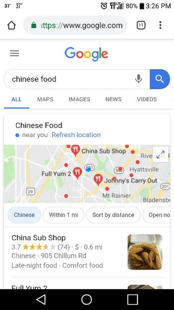
The SERP today has transformed from an optimized list of websites that might answer the question the user proposed. Instead, it provides users with a variety of different information and types of content based on the understood intention for the user. People see images, videos, maps, definitions, and more in addition to a standard list of websites. These alternative formats are called universal content.
Including structured data in a website makes it easier for the search engine to understand the type of content on the page and the value it might have for potential users. When brands include it on the mobile versions of their website, they can ensure that the content will be optimally displayed. It also ensures that Google will be able to take advantage of every opportunity to display the content.
With the mobile-first algorithm, Google will examine and index only the mobile version of the website. This means that they will not take the desktop version of the website into account when they determine rankings and display on the SERPs. If your structured data on the mobile site has been neglected or set up incorrectly, it will not do your site any good.
You can learn more about including structured data through schema.org. The markup here is understood and utilized by Google, Bing (Microsoft), Pinterest, and Yandex, among others. This means that optimizing your mobile site for one major search engine will also empower your display on other search engines.
Neglecting alt tags on your mobile images
Sometimes brands will fail to verify that their alt text tags have been properly added to the mobile versions of their websites. Alt text makes it easier for Google's mobile-first algorithm to understand the value and purpose of the images on your website. Despite the power of the Google algorithm, it still cannot see images, thus it relies on the alt text to interpret your site.
Not only do alt tags help with SEO this way, but they can also improve the user experience. Namely, if a user loads your page without images, the alt tags will appear and give them some insight about what the image was intended to display. If you have users who use a text-to-voice application, such as for those users with visual impairment, the alt tag will also allow them to take in the full site experience as you initially intended.
Although most people now understand the importance of adding alt text to their standard websites, a number of people still forget to include them specifically on their mobile sites. Given that Google will now pay attention to the mobile version of the site over the desktop version, however, these sites that neglected the alt tags on their mobile sites will now find themselves missing key SEO opportunities moving forward.
To create a quality alt tag, you want to generate a brief description of the image. This description should give you a decent idea of what the image contains if you were to close your eyes and have someone describe it to you. Thus, consider the image of a group of people using cell phones below.
The alt tag, “group of young men and women outside browsing smartphones” is a better alt tag than “people on cellphones”.
Including any targeted keywords that naturally work into the description would be ideal. Keep the tag from getting too long, aim for just a few words to communicate your key ideas.
Mobile devices and their heavy usage have transformed search over the past few years. With the release of Google’s mobile-first algorithm, however, brands everywhere also have to shift how they think about their websites, design content, and create online experiences for users. As you ensure that your site has been adequately prepared for mobile-first usage, however, many brands have missed a few key steps, as Google recently pointed out. As you plan your strategy moving forward in 2019, make sure that you have corrected any instances of these errors that might occur in your website.